
We frequently have the challenge of measuring and comparing different reports, metrics, KPIs, Data Sources against one another. Either to highlight their importance, relevant, issues, risks or criticality etc. One approach we have been using is an adaption of the UK Government threat level scale.

The concept is very simple, we have 5 classifications that can be used to demonstrate the status of the items you are comparing. Security agencies use the following:
- Low - an attack is unlikely
- Moderate - an attack is possible, but not likely
- Substantial - an attack is a strong possibility
- Severe - an attack is highly likely
- Critical - an attack is expected imminently
Extract from, https://www.mi5.gov.uk/output/what-are-threat-levels.html
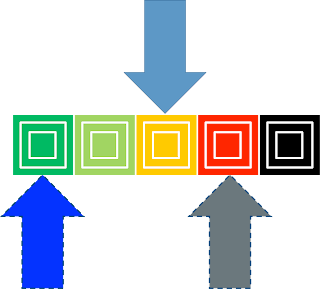
If we focus on the Threat levels we have a very simple, pictorial scale. We like this view because of the speed at which it allows comparison and the flexibility of the meaning:

This graphical view maps neatly to the descriptions used for defence, so for our BI needs:
- CRITICAL - Imminent risk or issue (black)
- SEVERE - Highly likely
- SUBSTANTIAL - Strong possibility
- MODERATE - Possible but not likely
- LOW - Unlikely (green)
In terms of the basis / relative measure then this can be adapted to the needs / comparison being made. Our suggestions are to make these SMART measures or as smart as possible and use as much detail as necessary - there is a fine balance between maximising meaning whilst keeping this simple. One that we have used recently is for the likelihood of data quality. For example:
"The likelihood of the data having a quality issue which would have an impact on the report production process and cause an SLA to be missed in 6 months".
Depending on the circumstances the different categories can be seperated by % likelihood:
- CRITICAL - Imminent risk (80 - 100%)
- SEVERE - Highly likely (40 - 80%)
- SUBSTANTIAL - Strong possibility (20 - 40%)
- MODERATE - Possible but not likely (5% - 20%)
- LOW -Unlikely(5% or below)
These scales can be adapted to the scenario. We have also had several comparisons on one view, i.e. the data quality example above with production risk and complexity (complexity uses number of sources rather than %).
Pointers
Once we have this defined for our classifications or indeed classifications if there is a report lifecycle review. The obvious pointer is for current state (colour schemes can be tweaked of course). The reason we like this approach is for its flexibility so we could have current state displayed above and also very easily show previous and desired state below. This is especially powerful when monitoring changes over time, essentially giving you a vector as to progress. We like to use this when showing the changes over time on a road map so that customers can see the benefits of the change over time.

We would be delighted to hear your views or examples of how you would compare BI components,
5point9
5point9
No comments:
Post a Comment